Creative Direction

Visual identity for Oxford Intersections
This was a collaborative project with the in-house design team. We developed concepts and mood boards to explore the innovative idea of Intersections – a collection to which academics contribute interdisciplinary research on contemporary topics including racism, social media, and AI. The themes of angles and kaleidoscopes were developed into a visual identity for the product and associated marketing materials.


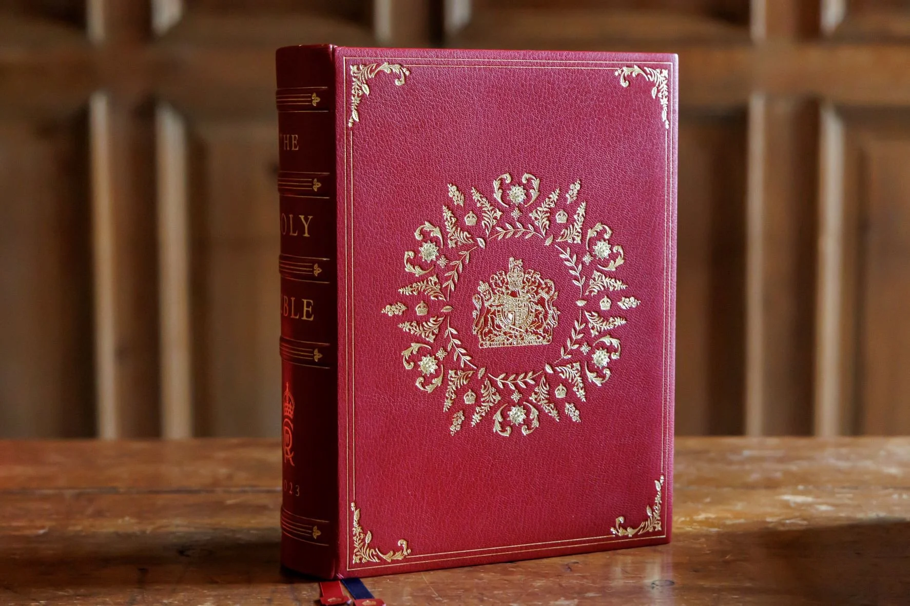
Coronation Bible for King Charles III
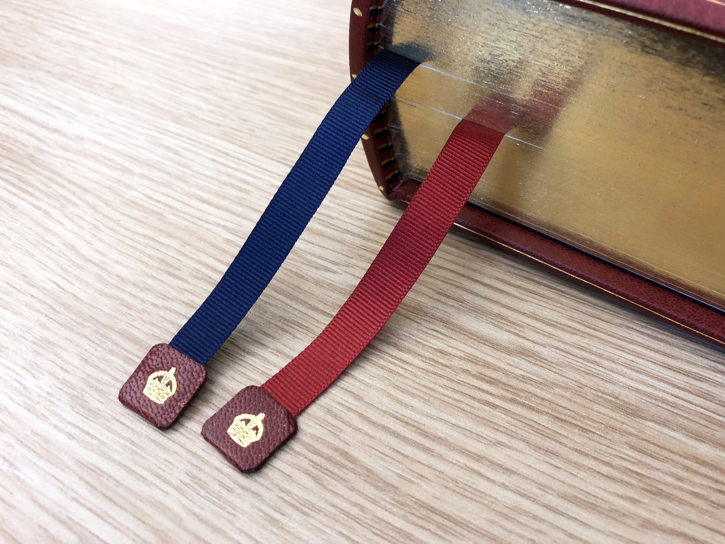
This is one of the most exciting and prestigious projects my team has ever worked on – literally designing a book fit for a king! The brief came from the Archbishop of Canterbury who trusted OUP to design the Bible for King Charles III’s coronation ceremony. We collaborated with the fine bookbinders Shepherds, Sagorski & Sutcliffe to produce a short run of leather-bound Bibles with beautiful details including inlay leather, blind blocking, and gold foiling. The timeframe was incredibly tight and great care was needed to manage the very important stakeholders involved. Everyone was incredibly proud of the finished design and watched with excitement when the Bible appeared during the Coronation ceremony.


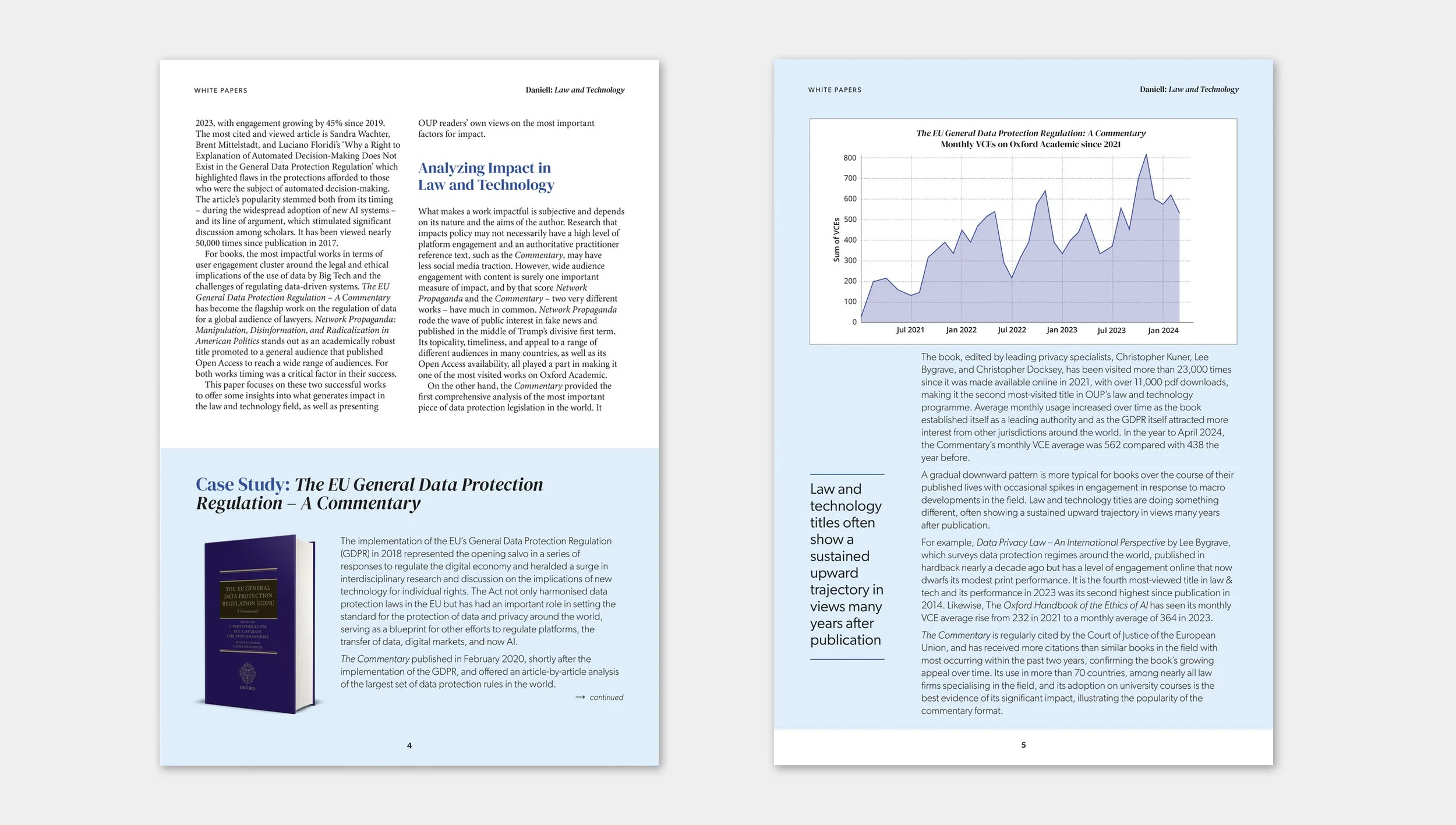
Thought leadership from Oxford University Press editors
I initially worked with a member of my team to research the landscape into which these articles would launch. We discussed and explored with stakeholders the extent to which the White Papers series should be aligned to the OUP corporate brand. I designed and typeset the PDF versions of the articles to retain a connection with the corporate brand through colour and typography, whilst still bringing out the editor’s words and ideas as their own voice.


Global rebrand of Oxford University Press
I represented the Academic Division during the global corporate rebrand of Oxford University Press in 2021. I worked alongside the Head of Brand, the Design Directors for Education and ELT, and the design agency SuperUnion. We wanted to ensure that the new visual identity represented the organization in a consistent and unified way across the world. Research suggested that the previous branding was not well-received by many customers, who perceived Oxford’s products as irrelevant to them. This was pretty heartbreaking given that the organization seeks to have a postive impact on education and learning worldwide.
The new logo is based on the “O” of Oxford and seeks to incorporate turning pages. The mark and typography also received some much-needed kerning and refinement from the typographer and logo designer Rob Clarke.
From the agreed new corporate identity, I then developed branding guidelines for Academic products and supported the development of branding elements and guidelines for Academic marketing and social media channels.


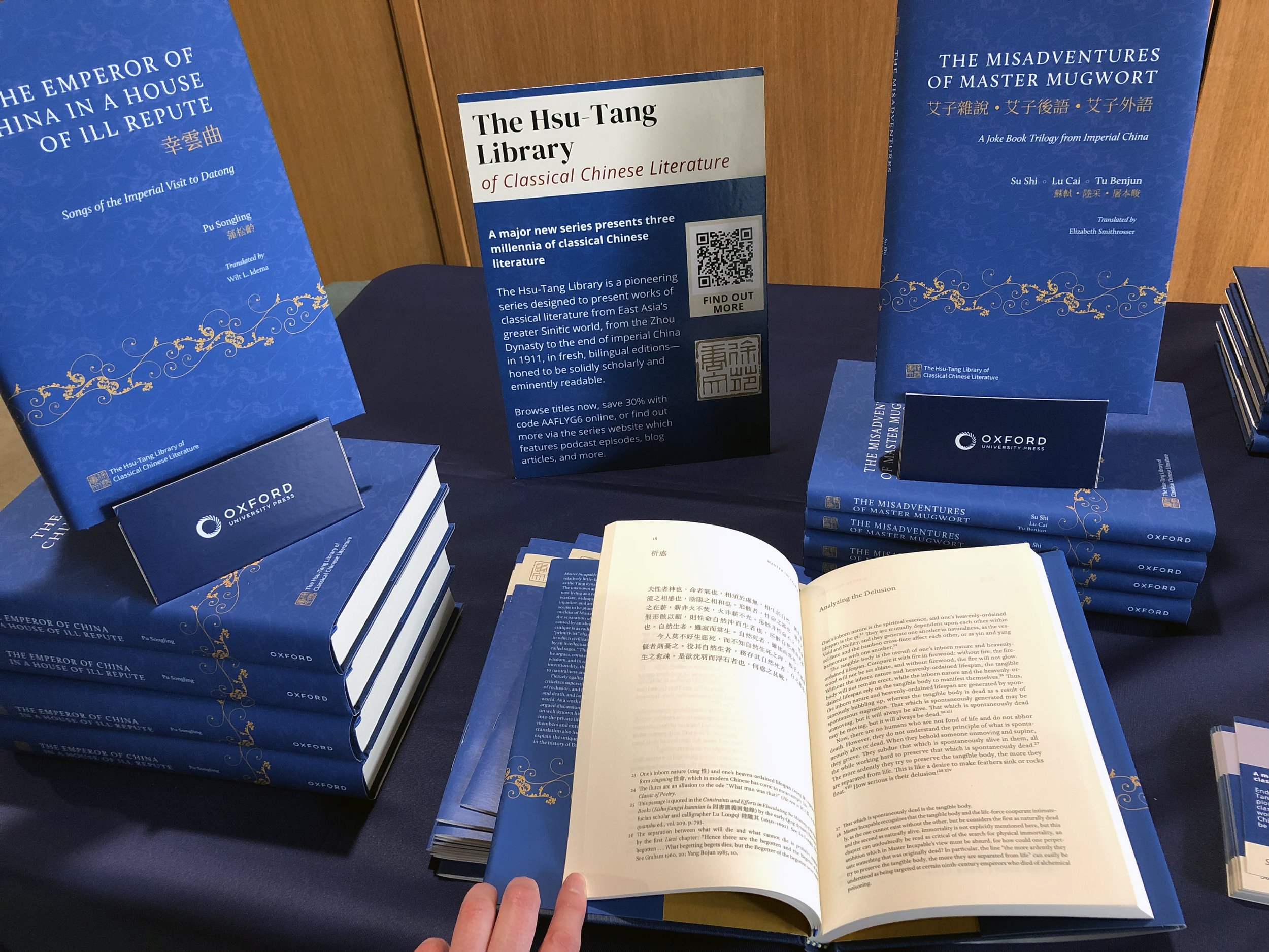
The Hsu-Tang Library of Classical Chinese Literature
This was a really exciting project to work on and presented some key design challenges. The Library will publish Chinese literature from the earliest works of the Zhou Dynasty to 1911, and will include works of literature, poetry, fiction, and drama. One of the first books to launch, The Misadventures of Master Mugwort, is actually a joke book from Imperial China. So we knew the design would have to cope with a wide variety of texts.
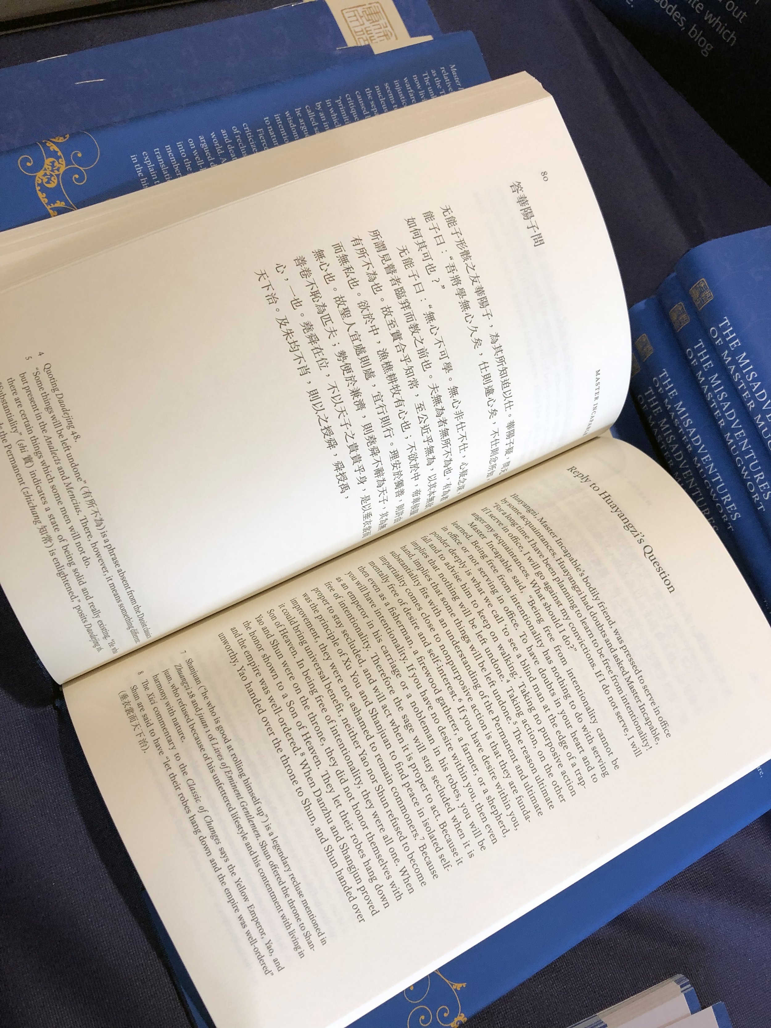
The brief was to ensure that the original Chinese text and the English translation would appear in parallel. We also needed to ensure that the design captured a key aim of the Library, to be "solidly scholarly and eminently readable". Keith Tam provided expert advice on how best to handle the typographic detail of the Chinese, and this led to a wonderful collaboration between Keith and Mak Kai Hang to create the beautiful series design for the interior of the books. Their thoughtful and and typographically precise design allows readers to enjoy the Chinese and English text, and access the notes without being distracted by them.
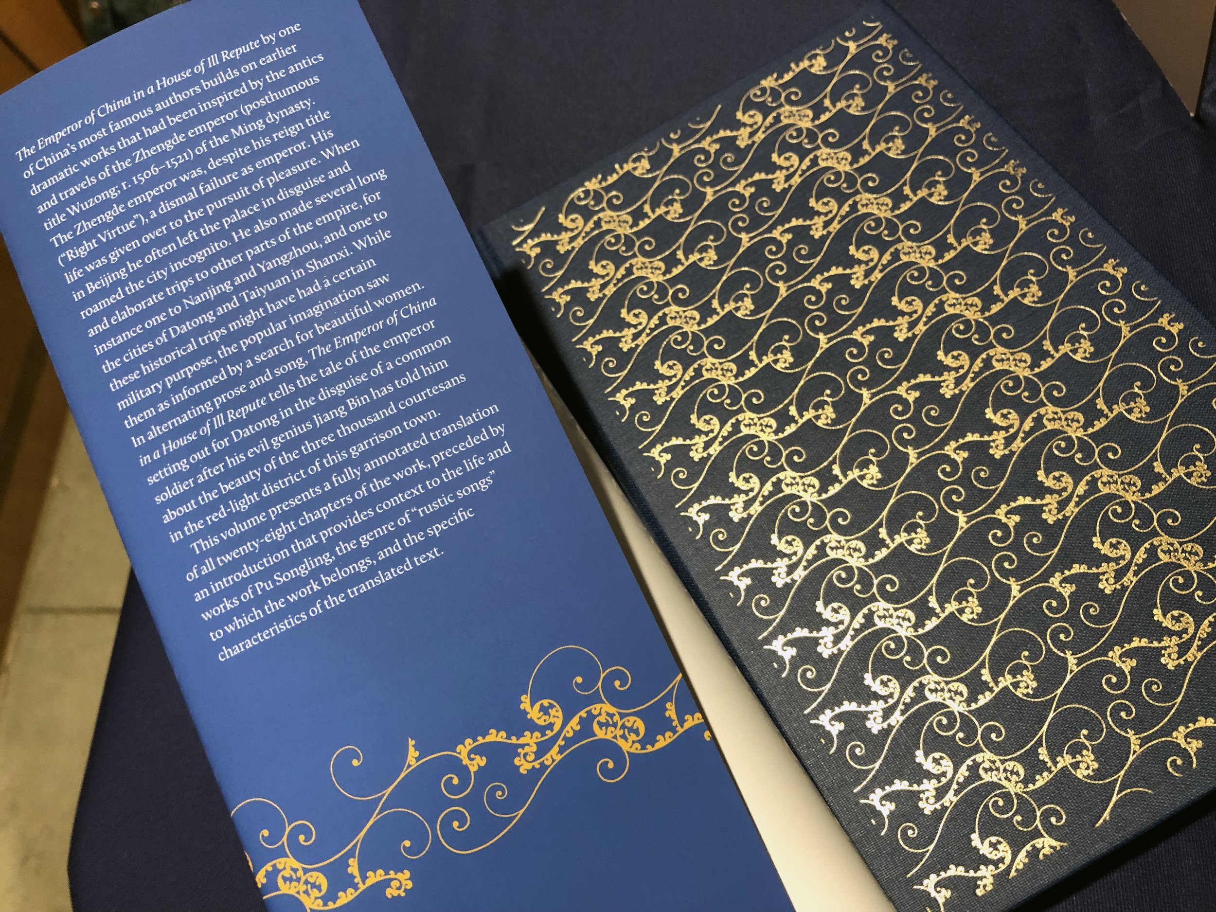
The covers were designed by Claire Dickinson and establish the books as collectable and exciting works of literature. When you see a ‘real life’ copy, don't forget to sneak a look under the dust jacket to see the beautiful blocking.